The links of our work:
Presentation online (iCloud): https://www.icloud.com/keynote/013x1EEpSkHXTfu_5NAFp_ipA
Spreadsheet online (Zoho):https://docs.zoho.com/sheet/ropen.do?rid=2um4289a0dcd97d8a4f25b84ebc7096e685b2

Personal Experience & Feelings
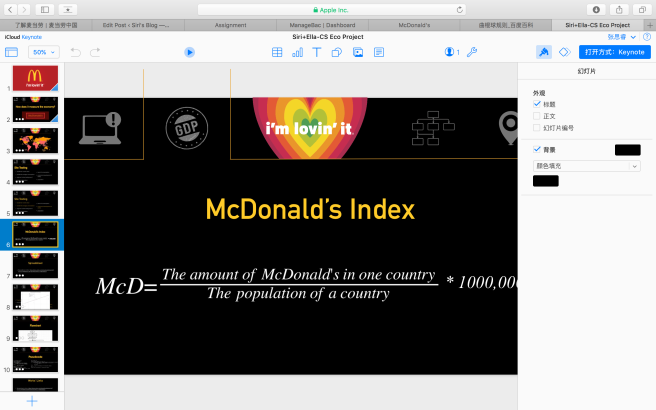
Personally, I really like my work and our effort, as a group, done to the presentation. I love the presentation I made really much and I think in my mind it is a kind of art rather than simply a homework or assignment. Basically, I did the presentation making, flowchart+Pseudocode making, background searching, and I also helped a bit with the spreadsheet formula. When learning spreadsheet in school, I just couldn’t help being amazed by the formula behind all the little cells. I think spreadsheet is a skill that will help one with his or her normal life a lot. For example, when comparing data and calculating data with the same method, usually people will just put all the numbers in calculator and then put all the results in a table. However, with the help of formula in spreadsheet, such things won’t even bother me again for I can just entering formula in spreadsheet just like what we did in this project comparing the GDP and McD indexes of selected countries.
I think the same is for presentation making. I know there are a lot presentation on how to work with iCloud. Yet I didn’t think that’s useful until this project. I was always bothered with the shift in styles and format when changing a keynote to a PPT or the reverse. This time, I just imitated the way that the presentation are given to us on the class webpage that people can collaborate with my presentation on viewing only. We encountered all kins of problems and difficulties in the process, however, we figured them out on our own. For instance, the flowchart is too long to put into a horizontal presentation, then I add an animation on it and made the duration of the animation long enough just for people to see the content clearly. I really enjoy the process of making a good looking presentation. I add gif and pictures from the official website and edit them to fit my presentation better. I made the gif loop back and forth and made some menu options using photoshop editing them with the same color and size. I really like this kind of work for I treat it as art. The process of trying and working things out are the things that fascinate me the most.
What to improve?
Basically, I think there are still a lot to improve on the skills of spreadsheet making. Some formula we used are not mastered steadily. For example, when applying a formula to cells in a row, the automatic change of the formula is supposed to be solved by adding a “$” in the middle if I remembered correctly. Yet it was not working. We also encountered problems making a graph. The problems were caused essentially for the sake of poor memory. We forgot how to do the tasks. Another example of the poor memory of us is that the problem we had making a pseudocode. The task of making a pseudocode was assigned to my partner initially, yet she had problem understanding and transforming the flowchart. After discussion about the translation, we decided to let me to write the pseudocode. During the process, I found that I almost forgot how to write a pseudocode! The solution to the problems are basically reviewing the presentations, which will also benefit for my final exam revising, and practice more. I think I will definitely meet the goals for I must do the review and I use spreadsheet in my science classes frequently.
